

Giving
substance
some style
Health Equalities Group
Visual and verbal identity
Helping Health Equalities Group tell their story without hamming up or dumbing down.

What we did
Positioning
Messaging
Tone of voice
Visual identity
Brand guidelines
Health Equalities Group is a public health charity working to improve the wellbeing of communities across the UK.
In particular, they work to tackle the circumstances that drive health inequalities in our society, empowering communities with the information and resources to make healthier choices and live happier lives.
Their work is vital and their story compelling, but the way they looked and sounded was stopping them telling it. So they turned to Lark.
“We were looking for a branding agency who could not only develop a new visual identity for the organisation, but bring the voice of the charity alive. HEG’s experience of working with Lark was overwhelmingly positive, from an early ‘discovery phase’ through to delivery of the updated visual and verbal brands for the organisation. Lark were excellent at guiding HEG through each step of the process, and we have received very positive feedback from our key stakeholders now the new branding has been applied to our digital assets across the organisation.”
Matthew Philpott, executive director

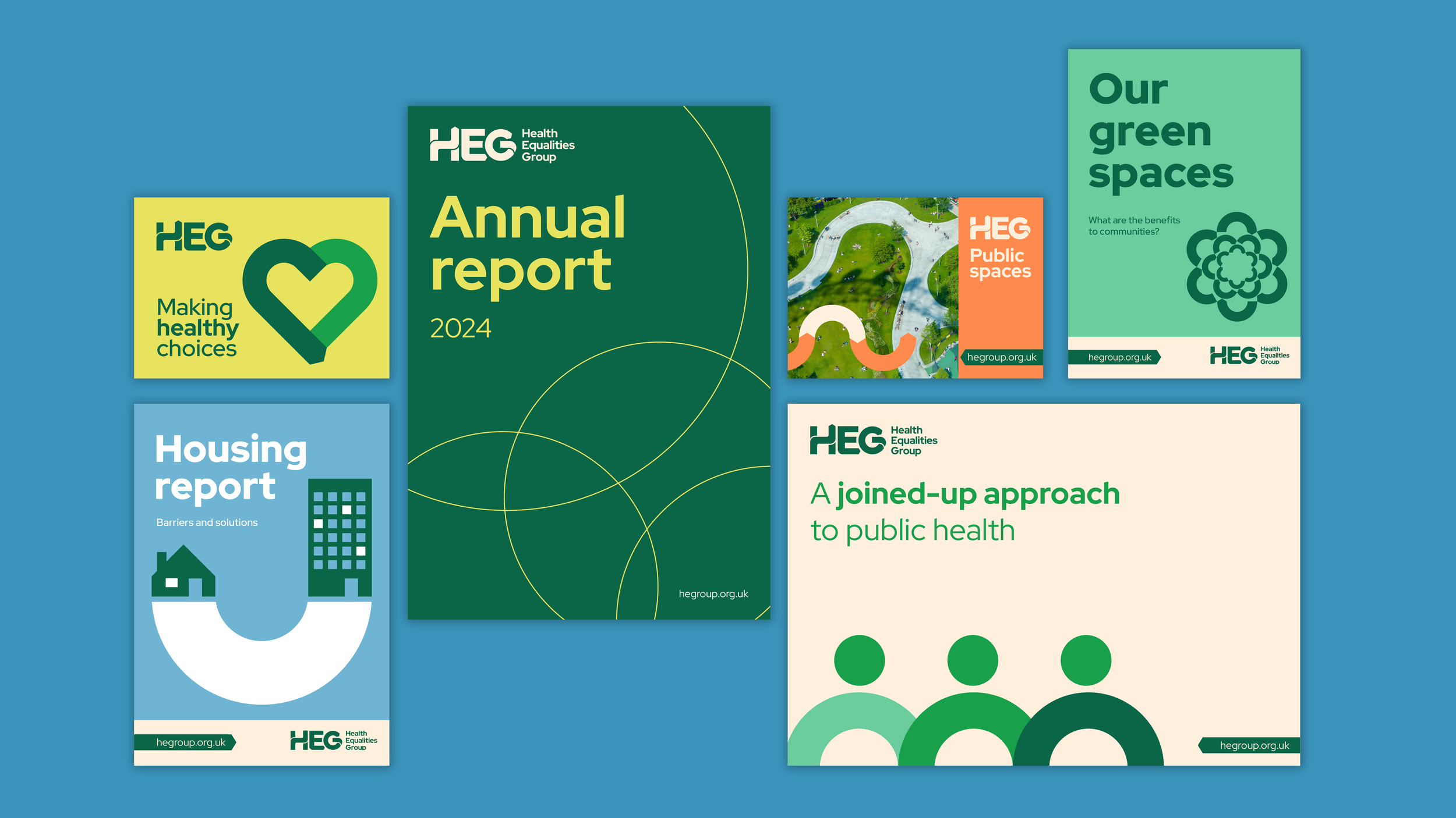
We then developed a new visual brand that balanced warmth and accessibility with professionalism and expertise, as well as bringing through the themes of sustainability, opportunity and choice from the verbal identity.

After a light Discovery phase, we created a new brand language that helped HEG go from dry and clinical to impactful and inspiring, without dumbing down or sensationalising what are often complex and nuanced topics.


