

When’s the right time for a charity rebrand?
As the saying goes ‘If it ain’t broke, don’t fix it’, but there may come a time when your charity branding is no longer doing the best job for your audience. Let’s take a look at the key questions to ask, plus some of the best charity rebrands, with a little help from pop’s personal branding expert – the late, great David Bowie.
You can ch-ch-ch-change (ahem) lots about your brand offering, from the name at the top or your entire visual identity, right down to the individual words you use to talk about yourselves or how you communicate with your supporters. But why is rebranding important? And how do you know when it’s time to start the brand refresh process?
What is a brand?
Before you decide on a rebrand or refresh, it’s important to know what your existing brand is – and it’s a lot! It’s your charity’s purpose, personality, values and character. It’s your identity and people’s perceptions of your identity.
In practical terms, it’s your verbal and visual identity. Your name, your tone of voice, your messaging, your mission and values. But it’s also your logo, your fonts, graphic devices, colours, illustration and photographic style.
You don’t have to change all of these at once. But if you’re going to change any of them, it’s important to think about the impact this could have. By asking yourself the following questions, you can work out how, when and why do a brand refresh.
Question 1: Does your brand feel unique?
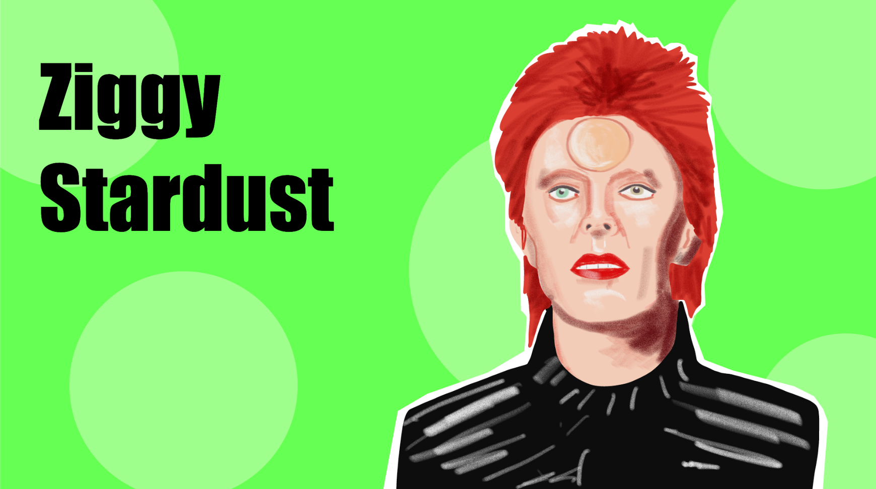
Trust us; no one knows about branding better than David Bowie. Ziggy Stardust exploded onto the music scene in 1972, a bisexual demigod in red boots with red hair and red lips to match. He was theatrical, original and – most of all – recognisable.
Bowie says: Stand out from your environment.
Hope for Children helps vulnerable children and families in the UK and developing world who have no other means of support. But their marketing manager Chris Lyne says it had become “increasingly difficult for a charity of our size to stand out in such a crowded market”.
So, in 2015, the charity underwent a transformation to differentiate itself from similar charities in the sector. They updated their brand – and at the heart of this was a redesigned logo.
They made an existing smiley face much bigger and replaced the corporate font with a friendly, hand-written style, to “reflect [our] positivity, whilst conveying the playfulness of childhood”. The result? A more emotive, recognisable brand that perfectly conveys the ethos of the charity.

Oasis Project works on the ground in Brighton, tackling some of the most difficult and underfunded issues in society such as women’s alcohol and drug problems, and dedicated programmes for sex workers. But it’s a tough, unglamorous cause, which makes it harder to fundraise.
To help Oasis Project rebrand, Lark decided to switch their story and focus on the hope the charity offers instead.
We created a new, positive logo for them – rainbows often appear when there’s sunshine after the rain – and carried this joyful style across their new visual and verbal branding, including messaging, flexible graphic devices and an optimistic tone of voice.

Question 2: Is your messaging up-to-date?

In 1973, Bowie killed off Ziggy live on stage, and moved on to a new persona: Aladdin Sane. This bold move meant he wouldn’t fade into obscurity under the weight of the numerous copy-cat Ziggys now in the charts.
Bowie says: Know when it’s time to refocus your messaging so it still feels relevant to your brand, helping you stay one step ahead.
Twenty years ago, Macmillan was well-known but not known that well. Although people knew the name, they weren’t aware of the full range of services they offered. Macmillan says, “We faced significant challenges, including the deeply entrenched misconception that we dealt solely with end-of-life care… It was time to do things differently.”
In 2006, the charity underwent a major rebrand, redefining what they were “in the world to do” and redeveloping their services. They also dropped ‘cancer relief’ from their name and became Macmillan Cancer Support instead. But crucially, by 2014, the conversation around cancer had changed again.
Half of all people in the UK now get cancer, so Macmillan wanted to refocus their messaging to better reflect people’s experiences of living with cancer, and the public’s growing awareness and understanding of the condition.
Their messaging switched from supporting people dying from cancer to helping those with cancer to “live life as fully as you can”. Not only does rebrand this create a sense of positivity and urgency, it better explains what Macmillan actually does.

Following the death of their patron Dame Deborah James in 2022, Bowel Cancer UK faced a turning point. Public awareness of the condition had never been higher, and the fundraising team suddenly had a huge opportunity to build on that momentum.
The problem? Their existing branding was holding them back.
Our job was to build on existing Bowel Cancer UK brand foundations but develop their fundraising comms so they created a real impact. This meant all their new supporters would receive bold, playful and exciting communications – a real reflection of Dame Debora’s personality.
The new materials don’t stray far from the charity’s brand colours and core messaging, but we gave the brand guidelines a twist; bringing in lots of new graphic devices, template styles and illustrations that really stand out.
So, if a charity-wide rebrand isn’t realistic for you right now, look at the identities of individual teams or events. Can you refresh the execution while staying within your brand guidelines?

Question 3: Are you offering something different?

The Thin White Duke was a troubled Bowie character; severely dressed with bleached blonde hair, and a much darker musical style than previous his personalities. But Bowie’s next alter-ego could not have been more different – Jareth, the Goblin King from the film Labyrinth, was playful, powerful and child-friendly.
Bowie says: Rebrand or refresh when you start offering something different to your audience.
Battersea has been running for nearly 160 years, so they’ve been through a fair few rebrands in that time! But we’re just going to focus on one.
In 2018, the charity dropped ‘Dogs & Cats Home’ from their name to show that an animal’s visit to Battersea should only be temporary – it’s not a permanent home. Battersea also has a number of rehoming centres across the country, so they wanted to avoid emphasising a specific home in a specific location.
Their visuals shifted too, moving away from a slightly sentimental, serious logo to a more modern, playful and positive watercolour design.
Battersea says the rebrand shows they’re compassionate but also an authority in animal welfare.

In 2022, Target Ovarian Cancer shifted their brand position to focus much more on ‘targeting’ what matters most in ovarian cancer care: better treatment, earlier diagnosis, more research. To mark this shift, the charity created a new logo with refreshed colours.
Lark’s job was to help Target bring their refocused brand to life, producing full brand guidelines and creating key messaging across their adverts, fundraising comms, research documents, policy papers and more.

Question 4: What’s happening in the wider world?

Bowie wasn’t always Bowie; he was actually born David Jones. Not the most exciting stage name. And already taken by The Monkees frontman Davy Jones.
Bowie says: Take a step back and look at your charity’s name and brand language. Are you keeping things the way they are because that’s the way they’ve always been? What are your competitors doing? What’s happening within our wider culture?
Even if you’re not thinking about changing your charity’s name – after all, it is a huge decision – think of other ways you use naming within your organisation, and whether this can be updated or refreshed.
As part of a wider tone of voice and messaging project for Guide Dogs, Lark were asked to rename lots of different services they offer, including challenging some of their existing terminology and brand language.
A good example is how Guide Dogs talks about its dogs. Many terms felt historic, rooted in clinical jargon, and not right for a general public audience. So, for example, we said goodbye to “stud dog” and hello to “guide dog dad”. A simple switch but very powerful.
And it was great to see the charity’s volunteers immediately use this new language ‘in the wild’, showing it was a much more natural way of describing the work the charity does.
Language is always evolving; what felt right 10, 20 or even just a few years ago may not be how you want to talk about things now. Take a step back and reconsider all your projects, initiatives, departments and terminology. Does your brand language feel right for 2024 – and beyond?
How often should you refresh your brand?
Good question – there’s no point changing something just for the sake of it. But the key lessons covered in this blog can help you decide if it is the right time for your charity, for the first or the 21st time.
To quickly recap:
1. Check that your brand still feels unique – can your audience pick you out from your competitors?
2. Is your messaging up-to-date – if you leave it too late, you could get lost in the crowd. Or worse, feel inauthentic or irrelevant to your brand.
3. Rebrand to reflect a shift in your strategy or services – if you’ve expanded or moved in a new direction, does your audience know?
4. Check your branding and language against competitors and culture – are you stuck in a rut? Have things shifted culturally? Is there a way you can develop your brand or brand language to help move things forward?
And if you’re still not sure, feel free to drop us a line and find out how Lark can help.
Remember, rebranding or refreshing your charity can be a daunting process but it’s also one of the most exciting times for your organisation. As David Bowie said, “I don’t know where I’m going from here, but I promise it won’t be boring.”
Bowie illustrations by Senior Designer Scott Welti, all other imagery owned by respective charities